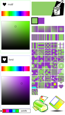
Many of you have asked for more color choices to use with ScrapColoring patterns. When we created ScrapColoring, Elsa and I handpicked 30 colors (a very tough task: one more pink meant one fewer blue!). We tried to select colors that go well together to give you as many as possible good looking color combinations. But it's necessarily a limited selection. So I tried to find a good solution to offer more possibilites to adults and older kids, while keeping a simple interface for the younger children. I think I found a good compromise: below the color palettes, you will find a button ![]() that allows to switch to an interface that offers the full color palette (16,7 million total). You first need to select the hue by sliding the upper cursor from left to right, and then you need to select the saturation (intensity or purity) and the brillance or lightness. It's very similar to the chromatic wheels from drawing software like Gimp and Photoshop.
that allows to switch to an interface that offers the full color palette (16,7 million total). You first need to select the hue by sliding the upper cursor from left to right, and then you need to select the saturation (intensity or purity) and the brillance or lightness. It's very similar to the chromatic wheels from drawing software like Gimp and Photoshop.

You can of course come back to the palette interface by clicking on this button : ![]() .
.
This new feature will hopefully be very useful to demanding colorists who want to be able to use the perfect color they have in mind, and also to all adults who use ScrapColoring for art and crafts like digital scrapbooking, decoration etc. For instance with the pattern generator, you can now generate printed papers and background patterns for your blog in the exact colors you want.
All those colors will also enable all kinds of creative and artistic experiments: you can now color Mona Lisa with the colors that Leonardo Da Vinci used. You can also reproduce color palettes that mimic pastel, watercolor etc.
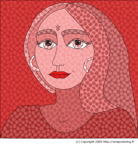
For instance the drawing below was colored with only one pattern and one hue (red): only the saturation and brightness of the pattern have changed.
Now it's your turn to experiment and play and to show us your results!
Comments
by Anonyme
on Saturday 03/03/2018 at 02:36
|
